Color in Design: The Art and Impact of Color

Laissez les bons temps rouler! People in Louisiana and throughout the country celebrate Mardi Gras, which culminates on Fat Tuesday, February 17th. The colors of tradition - vibrant purple, green, and gold. These colors are more than festive decoration—they carry meaning.
Purple represents justice.
Green symbolizes faith.
Gold signifies power.
These colors have become deeply embedded in the tradition and culture of New Orleans. At a glance, the combination instantly evokes the joy, pageantry, and tradition of Mardi Gras.
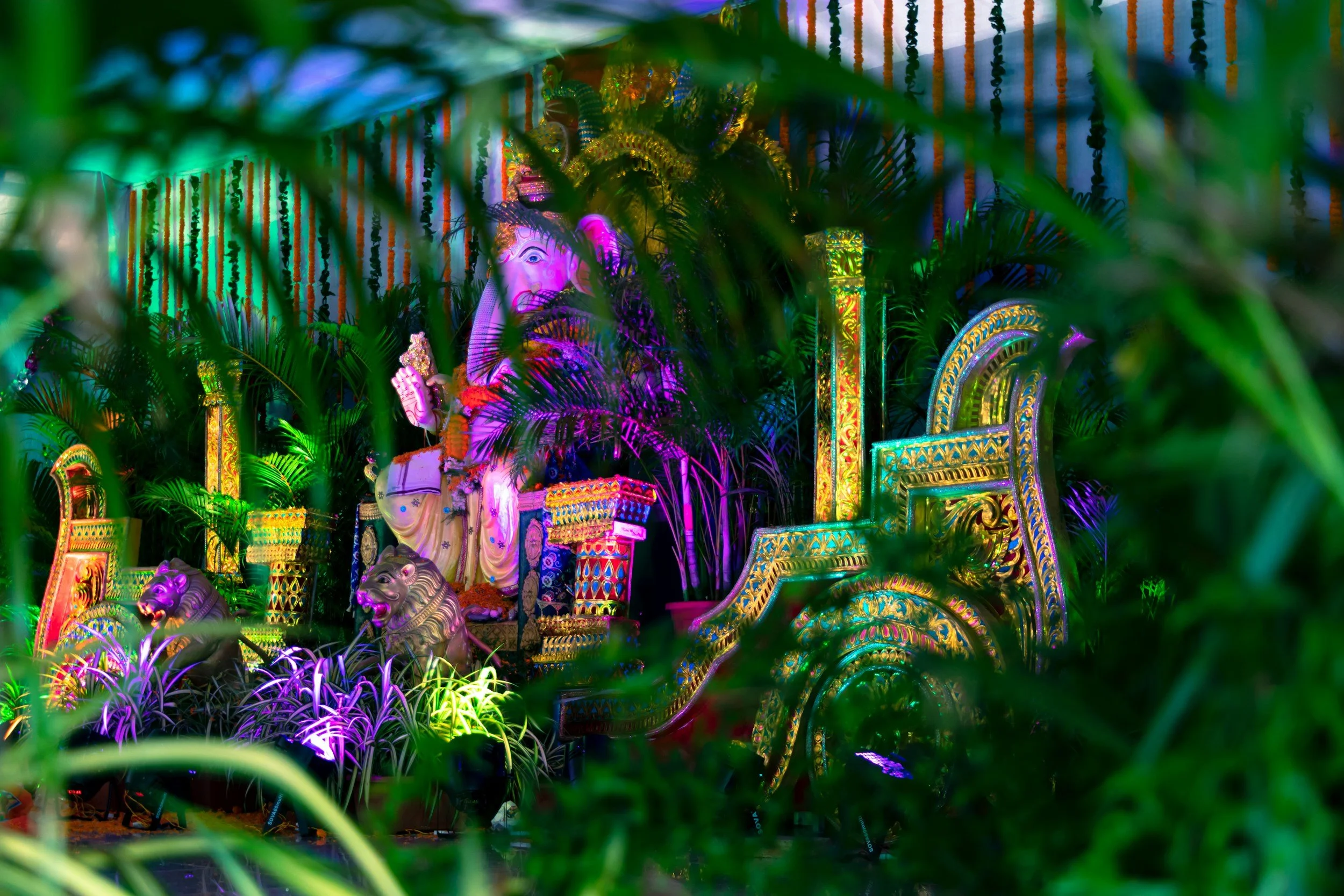
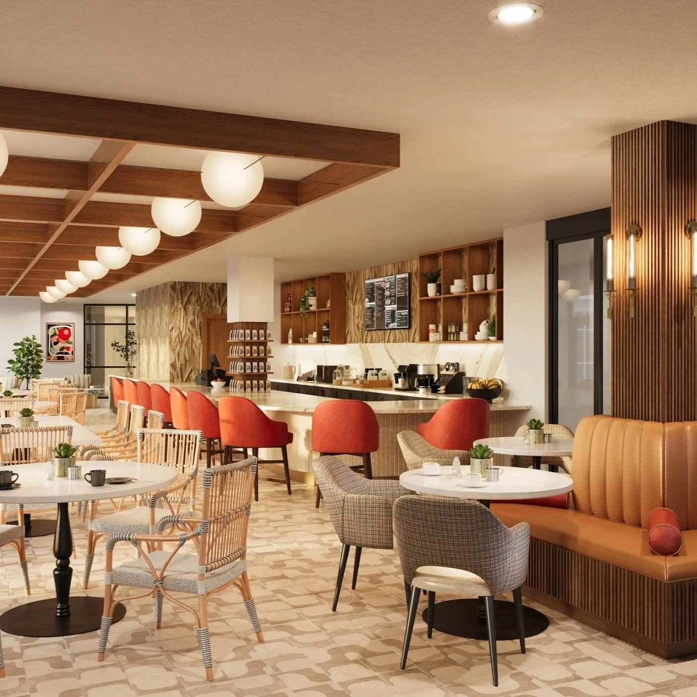
In many ways, Mardi Gras is a masterclass in the power of color—something we understand deeply as architects and interior designers; color is never an afterthought. It is a strategic design tool, carefully selected to influence mood, behavior, and experience. Cool blues and greens create serene backdrops for meditation rooms, therapy spaces, or exam areas where calm and clarity are essential. In contrast, richer hues such as reds, golds, and yellows energize dining venues and activity spaces, encouraging engagement and social interaction.
Of course, color does not stand alone. Artwork, furnishings, plants, lighting, textiles, and flooring all work together to shape the overall ambiance. Like a well-orchestrated parade, each element plays a role in creating a cohesive and memorable experience.
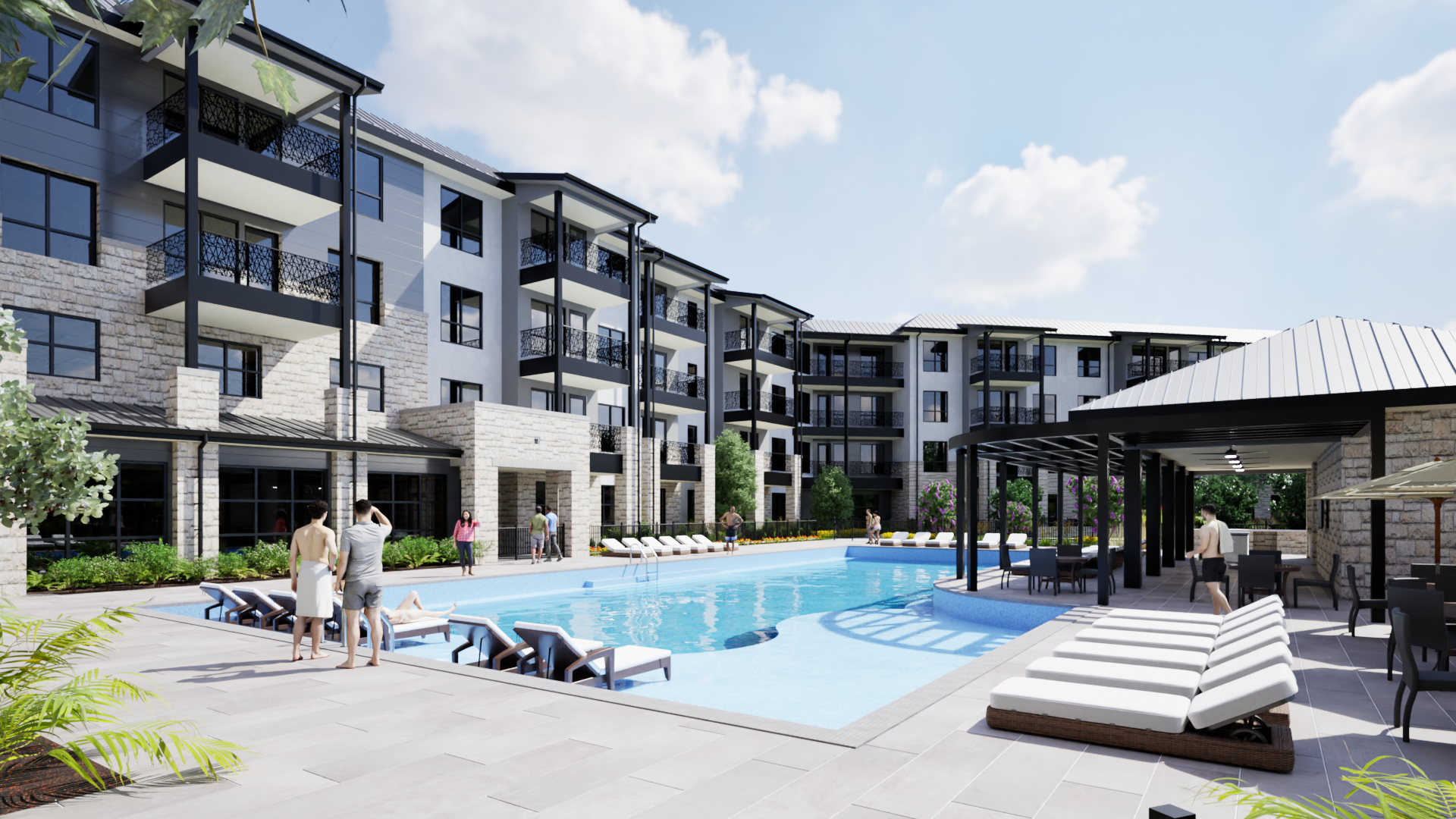
Beyond establishing mood through color, design becomes even more impactful when it reflects a community’s identity—using art and imagery to tell its unique story and create a deeper sense of connection. For example, in communities where residents grew up in the country or lived on farms, the colors of the fields, golds, greens, and browns, offer an earthy, familiar ambiance. Additionally, Capstone at Station Camp, a community Pi designed in Gallatin, TN, was built on the site of a long-time plant nursery and greenhouse. Artwork in the private dining room depicts mums, hydrangeas, and poinsettias, the most popular flowers sold in the nursery.
Beyond creating familiarity and connection, color and art also play a measurable role in supporting health and well-being. Research continues to uncover evidence of how various colors promote wellness, and the relationship between color and senior living residents is especially compelling. The design team at Pi incorporates them into wellness-focused environments that nurture both comfort and care.
For example:
Green promotes relaxing energy. In The Dementia Concept, Joshua J. Freitas notes that green can stimulate energy while also encouraging relaxation, and is often one of the last colors perceived as eyesight declines. Incorporating saturated greens and blues in dining areas, such as at Heartis Arlington Memory Care, creates a peaceful atmosphere while reducing glare.

Blue calms the mind. Studies suggest blue environments can decrease confusion and enhance concentration. In therapy gyms like the one at S.P.J.S.T Senior Living, blue tones support focus while lighter wall values reflect natural light and improve wayfinding.
Red can stimulate appetite. Research cited in The Dementia Concept highlights the color red and its effectiveness in encouraging residents to finish meals, a principle long embraced in restaurant design. When used thoughtfully, such as in lower-chroma rustic brick tones, red can enhance warmth and sociability without overstimulation.
Bold contrasts improve confidence and independence. Big differences in hue and value help residents with visual impairments better distinguish objects and navigate spaces. However, contrast must be applied intentionally; abrupt or overly dark flooring transitions, for example, may be perceived as barriers rather than pathways.
As we celebrate Mardi Gras and its iconic palette of purple, green, and gold, we are reminded that color is far more than decoration. It is identity. It is memory. It is emotion. And when used with purpose, it transforms buildings into vibrant communities that truly feel like home.
Contact us here or call us at 512-231-1910.